|
|
Post by Nashville Predators on Oct 23, 2022 21:18:23 GMT -5
Earlier this week, the NHL release the 2022 Reverse Retro uniforms. Time for another good ol' jersey debate. What your favs, and which ones belong in garbage.? www.nhl.com/news/2022-adidas-nhl-reverse-retro-jerseys-reveal/c-336511528Top 5:1. LA Kings - I thought the 2020 LA reverse retro jersey was awesome, this ones just as good, if not better. They really should switch to purple and gold as their primary colours. Crown LA the kings of Reverse Retro  2. Pittsburgh Penguins - Two words: Robo Penguin. That is all 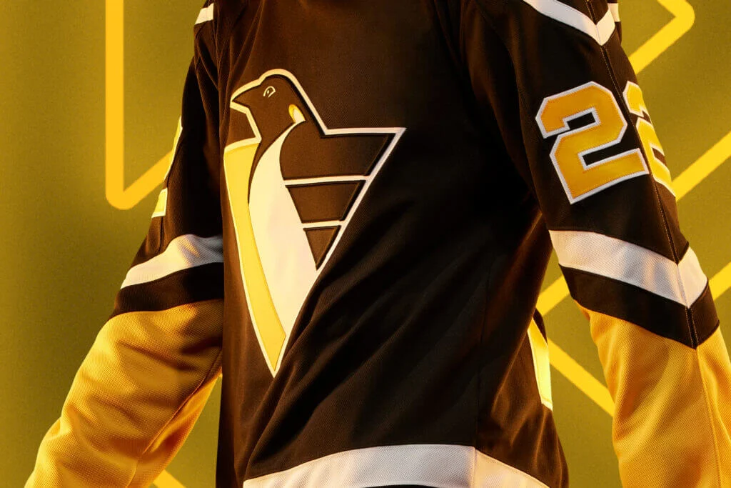 3. Florida Panthers - unique, creative, and great looking. Florida knocks it out of the park with this one  4 - Colorado Avalanche - sharp re-interpretation of the original Rockies jersey. Think I would have preferred if the Devils had this, but great looking uniform nonetheless  5. Minnesota Wild - is it just a boring home version of last years jersey? Yes. Does it still look sick? Absolutely!  Bottom 5: Bottom 5:1. Detroit Red Wings - A bunch of stripes with the city written across the middle + the wrong colour scheme lands Detroit at the bottom of the list 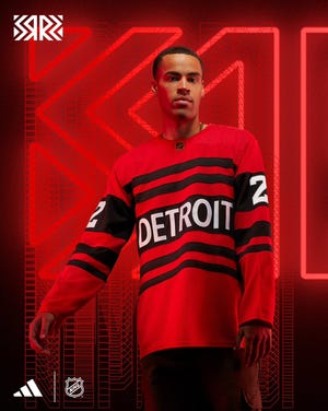 2. Chicago Blackhawks - see Red Wings /cdn.vox-cdn.com/uploads/chorus_asset/file/24126682/20221020_105924.jpg) 3. Edmonton Oilers - They took one of the worst logos ever, and somehow made it worse 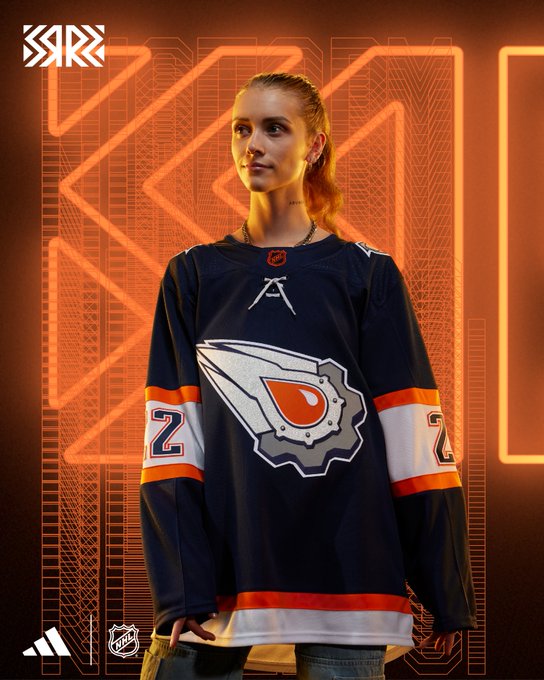 4. Dallas Stars - on the list solely because there is still no Mooterus 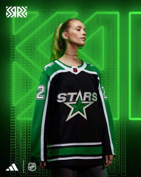 5. Carolina Hurricanes - Might sound hypocritical because of my Minnesota pick above, but all the Canes did was take a bad alternate jersey and change the main colour. Still boring and bad  |
|
|
|
Post by Arizona Coyotes on Oct 24, 2022 11:17:07 GMT -5
I'm on the same page as you. My top 2 are the Avs and Panthers. Bottom 3 are Detroit, Chicago and Carolina; it's like they didn't even try.
|
|
|
|
Post by Vegas Golden Knights on Oct 24, 2022 14:31:46 GMT -5
Love this debate. Here’s my list:
1. Florida - This one slaps. Unique, great colour scheme, screams Florida. I love it
2. Pittsburgh - Logo is a classic, black & yellow colour scheme always looks sharp to me. They got the “retro” spot on
3. Buffalo - Love the logo and the jersey just looks super slick to me.
4. New York I. - Took an originally terrible concept (Fisherman logo) and improved on it. The jersey looks great to me.
5. Washington - Gives me early Ovy vibes. I love it.
Honourable Mention - Vegas, I know this one is hit or miss to people but I’ve always been a fan of the diagonal lettering for jerseys. For a team with no history, they gotta make a new concept and I thought they nailed it. The glow in the dark is a uniquely cool feature too
32. Seattle - Another team with no history…so the theme is hard, but the jersey looks like vomit to me and a missed opportunity for a nod to the original Metropolitans.
31. San Jose - The Seals throwback just doesn’t do it for me
30. Calgary - Could have been a great sweater…but that stripe at the bottom ruins it. Disappointing as I live there
29. Edmonton - That orange oil drop is pretty gross
28. Winnipeg - Just…blah to me. Boring
I did reallyyy hate Detroit’s originally, but then I saw the whole uniform together & I changed my stance. It looks sharp altogether.
|
|
|
|
Post by Calgary Flames on Oct 24, 2022 18:15:25 GMT -5
Boston's fucking sucks, and I'm a Boston fan
|
|